GAMA3000 - Game Art Portfolio Project
SHINDY LEONG
SHINDY LEONG

Updating from 5th January, I have so far been keeping up with my timetable. I managed to finish all high poly models, which will be sculpted in Zbrush now. Due to the pandemic and issues with travelling during Christmas I have been on good track with my timetable, I spent a couple of hours each day working on the assets.
I think I will finish my sculpting earlier as I have around one month to finish my high priority assets sculpting. When creating the milestone, I did extended the cells to give myself more time if needed. I'm glad I have been dedicated working on the project and keeping up with my schedule so far.
Other than that, below is my process I have done during the break. I have refined the final low poly models, UV mapped and created the high poly models that is ready for sculpting in Zbrush.
This is a pipeline for each individual asset, the high priority ones will consist of more work, which will include sculpting and baking. The medium/low priority assets will consist of modelling, uv and texturing. The pipeline might not be entirely precise, there will be some changes for sure. My highest priority is the Dance Dance machine, during my developing stage I will note down my working hours and process. This will allow me to get an overview how long it takes to create one asset. From there I can get an accurate plan for the rest of my assets and adjust my schedule.
Alongside that, I will create custom materials, this will be for my supplementary skills module. From this pipeline, texturing is one of my weaker areas. Therefore, I want to focus on improving my skills and knowledge within the texturing area. As I mentioned last semester, my design goals were storytelling, composition, and lighting. Texturing will be a part of the storytelling as it will make a difference when the damage, stains, grunge, scratches etc are applied. Later, I can focus on the composition and lighting to do further adjustments.
The software I will be using are, Maya, Zbrush, Substance Painter, Substance Designer and Unreal Engine. Once I reach my final stage, I will consider using Marmoset Viewer to show any of my high priority assets and include it on my portfolio. I want to be able to have a fly through of my environment as I want to capture the lighting and show close-up details of the assets.

I created a schedule in Google Calendar. This is an overview of my week, it's not entirely precise. I usually don't use Calander to plan out my day, it's mostly weekly reminders of other stuff. I prefer following deadlines or milestones, as I feel like there will always be some changes if I were to create a weekly schedule. I use Trello checklist for all my module work and I write down my daily schedule on paper as I focus better.
I will take breaks in-between and do other activities to get some rest from work. Due to the pandemic, I feel like I will have more time working on the project. The blue section is this module, I expect to spend at least 20-25 hours a week on GAMA3000. There might be more time to work on the project since GAMA3005 relates to this project. I do work overtime sometimes, which is during my free time. I don't mind, as I enjoy working on this project and do focus better on the evenings sometimes.


New low poly
Refining final low poly
Before creating the high poly assets, I went through my low poly priority assets. Making sure the details and the objects were similar to my reference images. A few of the measurements were missing around 10-20 centimeters, the reason is because the dimensions I got wasn't the exact same as the reference images. There were also some extra faces which increased the tri-count, this was because of extruded faces I didn’t notice.
Other than that, I'm satisfied with the new low poly models as I have cleaned up everything. The tri-count has slightly increased for some assets, but these are my priority assets, it's fine as these will be more visible on the scene and camera. The tri-count should be fine for the game engine to handle and for PC.
Preparing for sculpting
To prepare the low poly assets for sculpting and baking, I need to create the high poly assets first, this is to prepare the mesh for Zbrush where sculpting will take place. To be able to sculpt, it will require more polygons. I used Maya to create the high poly assets by subdividing and adding edges around the corners. Since I have several separate meshes, it would be a better option to do everything in Maya where I smooth and subdivide the assets before importing to Zbrush. If I import the whole as one mesh, there will be some areas that will be rounded. By using the Subtool in Zbrush, it will allow me to work in layers where I can smooth and subdivide the meshes individually, if wanted. This is more efficient since I will use some noises to add some texture and prevent the application from crashing when doing further subdividing and smoothing.
I decided to UV map before sculpting, only the low poly model needs to be UV-mapped since the high poly will be baked into the low poly. There could perhaps be some retopologizing later, if there is a lot of difference between the low and high poly asset, such as the surface distance which could give weird results.

High poly

Following my pipeline, I'm currently at the sculpting stage. Pipeline is to keep everything organised and what needs to be delivered. Since this is a personal project, I have my own pipeline. Whilst various game studios have a stricter pipeline everyone follows, although it's different for all studios. The production stage takes the longest, that why in the pre-production stage I had to plan everything and experiment. This will help me approach my production stage efficiently and prevent me from spending too much time on specific areas. [1]
I used similar pipeline in GAMA2005 - Game Art Environments, what's new in the pipeline is Substance Designer where I will create some materials. Although, I will mostly use free materials for this asset as it's quite simple materials such as metal, wood and glass. Other than that, majority of the asset will contain decals.


The high priority assets have been UV-unwrapped already, I want to get it out of the way so I can focus on the sculpting. I will be documenting and go more into depth with the Dance Dance machine as this is my first asset creation. I feel like this is where I learn the most, analyse, come across most issues and learn new methods. By documenting my process, I can use the best method I prefer and include that for the other asset pipelines.
In my pre-production stage, I came across some issues with texel density, this affected the texture resolution when I applied the decal. This time, I made sure to use up most of the UV space. I scaled up the smaller UV shells to fill up the empty spaces. By using the UV spaces, the UV shells becomes larger and gives more density.
Uv unwrapping wasn’t an issue for me, as I feel like I have got better knowledge within this area through experience. I will be using color ID, this will allow me to work in layers and I don’t have to mask each mesh individually. The different colors are the materials I will be using, dark blue is wood. Color ID helps me stay organised and I can make sure all materials are there.


I did a mistake when subdividing the mesh, I didn't subdivide some areas properly. There were some rectangular and triangulated polygons. When sculpting in Zbrush, it would stretch the whole mesh, I had to go back and retopologise the separate meshes in Maya, I assumed having some rectangular or triangulated polygons wouldn't affect the sculpt so much. But the topology of those areas was too difficult to fix, usually subdividing and smoothing the mesh would solve the issue. Luckily, I came across this issue quite early. I will need to keep this in mind when sculpting the rest of my assets.

Issues - Smooth lines
I was having some trouble trying to smooth the mesh by only using "smooth" in Zbrush. Using this method didn't work to flatten the lines or the smooth brush. Even though I had everything smoothed in Maya, the imported file from Maya wasn’t supported in Zbrush. I assume this is because I didn't subdivide it enough. I found some useful tips, in this case I used dynamic subdivision which also smooths the surface without dividing the polygons. I found this tool useful as I can adjust the increase bevel edges, and smooth the base mesh evenly.


For the reference images, I wanted to focus on the close-up images to capture the details better. I wasn't able to find a lot of images of the machine, but this should be enough to follow. When analysing the reference images I paid attention how some materials behave, such as the plastic Dancing Stage Euro Mix 2 material. (image above). With the reflection I was able to notice how the wrinkles on the plastic material behaved. For the coin machine, I have marked three areas I could use the alpha maps which will be baked into the low poly. This will save more space and polycount, since this isn't a large part of the asset, the player won't notice it's baked unless the look very close.

Other than that, the metal that is covering the edges wouldn't need any sculpting since it's a hard material that contains scratches that can be applied in Substance Painter. A couple of the images are taken by me when I visited the Retroids Arcade Bar in Worcester. This was very useful since I wasn't able to find a lot of reference images online.

Following the reference images is a great way to give better results, this will give more realistic and accurate. There weren't a lot to sculpt, although I added smaller details such as the wrinkles, wood damage, noises, alphas and more. For the wooden damage, my thoughts behind it are that other items have hit the machine on the edge. The bottom part could have been scraped by the ground or floor when the employees have been moving the machine.
I created two very simple alphas in Photoshop, these were applied on the coin machine. This could also be done in Substance Painter as well, however I wanted to see the different results it would have using Zbrush. Smaller details such as screws and lines on the platform will be applied in Substance Painter. Doing this is Substance painter will allow me to have more control as I can apply the alphas or normal map on the UV map. This also saves polygons to take up less space and this is less visible for the player therefore using alphas is a better option. During my process I used standard brush, clay brush, dam standard and move tool. I added larger details first to build the shape and eventually fixed the details using the dam standard brush.

1. Issue crash in all software - Too high poly
When attempting to bake the object, the loading time would take extremely long time. Before that I had issues exporting as an OBJ in Zbrush and Maya due too high poly count. I realised I had some unnecessary meshes I subdivided, these meshes wasn't sculpted at all. So, I reduced the meshes to subdivision level to 1 and exported four subtools as OBJ to prevent the crashing. I basically divided the Dance Dance machine into four parts to minimize the memory and faster loading time. I already came across a lot of crashing when importing those four OBJ files to Maya. I kept reducing the polygons by using the reduce tool in Maya 50% repeatedly without losing any details. I deleted a couple of the high poly meshes I didn't sculpt, I replace the high poly models with the low poly models. It also had better results as it had smooth edges and didn’t look any different.
It was quite a long process to fix it, as the high poly models would slow down my process and loading time. At this point I learnt not subdivide meshes I won’t sculpt and at least keep the subdivisions low at all time, as one mesh can take up to 500 000 polygons. This was also a larger asset with various subtools, it's my first time working with a larger asset so it was expected I would come across some issues. This is something to keep in mind when I develop the arcade machines later.

I had some weird results with the normal maps and ambient occlusion when baking. None of the details would appear due to the black maps. When searching around for solutions it could have been caused by various reasons such as:
UVs overlapping each other
Wrong scale on high poly
Objects not aligned correctly
Flipped normals
I assumed it could've been one of those reasons above, but none of these caused the black normal map or ambient occlusion. However, I read that when selecting Match Mesh By Name in the baking window, all layers should have the same name convention. Using Mesh By Name will bake the low poly and high poly with the same name, it's to avoid any issues when baking. The textures will also look better and baked properly giving better results. [4]
Solution for issue 2 : I managed to get the normal map and ambient occlusion working by renaming the high poly models to the same name as low poly ones. This will isolate the baking when using Mesh By Name. If I don't have the high poly layers named the same as the low poly, it will give me black normal map and ambient occlusion. [6]


I decided to do some reading about baking in Substance Painter as I want to get a better understanding of the different settings in the baking window. Since I don't know much about the frontal distance and rear distance. I have the platform on the Dance Dance Machine I want to bake into the low poly but couldn't get those details appearing. Knowing the value and the purpose of the settings I don't have to spend as much time re-baking all the time.
I also looked at David Masana's understanding and process of baking in Substance Painter and tried his baking settings. The frontal distance is the external cage, meaning how far I want it to be baked. Whilst, rear distance is the internal cage, this decides where the ray will stop. Ray is the distance between the frontal distance and rear distance. [3] [5] In this case, I would want the rear distance to have a slightly higher value to get the high poly details on the platform to be baked onto the low poly platform.


Baking - Mesh part bleed
My baking was quite successful besides that the mesh had a couple of bleeding, which are the dark spots I have marked. I was considering re-baking the mesh, but I would have ended up with the same issue. Perhaps less bleeding on the mesh, baking took such a long time. Therefore, I decided to painter over the normal map and ambient occlusion map. I was already quite happy how the machine turned out as I managed to get the high poly details into the low poly platform.
The bleeding usually occurs on the normal map and ambient occlusion map, this was caused due to the frontal distance as it had a higher value. The solution I found was painting over baked normal map and ambient map, this is an easy method but also time consuming. This was done by switching the normal and ambient occlusion map channel from combine to replace, this will allow me to create a fill layer and layer to paint over the bleeding.


Some areas had very obvious dark spots such as the top speakers and the screen. Those meshes had a black ambient occlusion map, by selecting channel viewport (c shortcut key) I could easily notice any issues and paint over them. Only thing to keep in mind is when I export my textures, I will have to save it as mixedAO, this will save the manual changes I have done. I found this method very helpful and useful.

I will be using alphas to add further details, I will create my own alphas in Photoshop and use the alphas in Substance Painter. Alpha map is a black and white image which is stamped as a height map. The black and white will add shadows and sort of create an illusion of the details, but the surface is actually all flat. This will be used on smaller details that doesn't require any modelling since it will take up too much poly count. And most of the time, the players won't even notice the smaller details. Alphas is going to be the key to get the final and realistic results as the reference images, I will be using alpha bolts, circle dots for the speakers, different shapes of geometries etc to get the final results.
Applying Alphas
Following the tutorials above, it was fairly easy to understand how they demonstrated how to create and use the alphas. The white basically adds the height while the black maintains its natural surface. Before, the platform only had a couple of details baked. During my pre-production stage, I thought it would be easier to just use the alpha method since I can adjust the height map as wanted. Because, I think if I modelled and baked all the details, I would have missed some details or have some issues. Working in layers was perhaps an easier and more efficient choice for me, as I can erase and adjust the options.
Following the reference images, the machine contains a lot of bolts and I feel like this would make a huge difference. I used the alphas in Substance painter on the platform where I could add lines to show the separate parts of the platform. And the bolts that secures the plates and keeps them in place. And for the screen, I decided to create my own alphas as I couldn't find the shapes I wanted. These alphas could be useful for future projects, so it's always good to keep them saved in a folder. I'm quite happy with the results as I can see there is a big difference on the before and after images.
To show another example and useful method, I used alphas to create the speakers. As I have been spending several hours in Substance Painter I'm starting to get a better understanding how to use alphas and the different layers. At first, I was planning to create textures for the speakers. But considering the shadows and the metal grid laying on top of the speakers. This seemed like a more complex and time consuming method, instead I created my own alphas and started shaping out the speakers. I like the idea of experimenting with the alphas and try new methods, I enjoyed this part as I saw this as a part of problem solving and be a bit more creative. Being able to enable/disable the different channels makes it more efficient, as everything is already displayed on the 3D and 2D viewport. I can easily adjust the height map, colors, roughness etc.
During the developing stage, I have been able to analyse the process and perhaps change the other asset pipeline I will be working on later. There is a lot of experimenting with the first asset creation allowing me to find the best method to work with . At this point, I'm considering skipping sculpting on the some of machines as it's hard surface. The silhouette won't change after sculpting, there will only be small details added around the edges. This can be done in Substance Painter using height maps, the baked details were low res due to poly count. I had to lower the poly count when exporting from Zbrush as the file kept crashing. Using the alphas has given me better results and I will have more use of it when it comes to the machines.


Instead of using the default environment lighting in Substance Painter. I decided to use the same HDRI as I have in Unreal Engine. The lighting will be more accurate and textures will be easier to work with. And I can easily rotate the lighting to see how it affects the asset or how the material behaves.
Tutorial I followed to create the glass and dirt I will add later on when I finish applying all the materials. Will be used for the other machines as well.
Tutorial to create the speakers dots/circle pattern
As I mentioned in my pre-production stage, my plan was to use a metal grid material by Łukasz Sommer. I was going to use the material because it was very accurate to the reference images the speakers had. But after testing the material in Substance Painter I ended up with these results (right image). I used polygon fill and could mask out the unneeded circles/dots. But the circles aren't dark or have holes as I wanted, this is due to the scale and perhaps my UV is too small. If the metal grid is larger the material will appear the same as the material shown on Lukas Artstation. I tried adjusting the settings and play around with the channels, but it didn't work.
The other method was to create my own alpha but I ended up with weird reflection. This was due to wrong height and wrong colour was selected for the normal map. The dots were also to close to each other making it look very cramped.

Final metal grid - Speakers - Solution
My attempt to create the metal grid was to create my own alphas in photoshop as shown in the image. My solution for this was to first re-create the speakers dots/circle pattern as the gaps were too close. I turned on the height map, put it to 0, since that allowed me to get the flat surface as the reference images are showing. Increasing the height map would have created bumps around the circles, which wouldn't be accurate to the reference images. The normal map was changed to a darker shade, dark blue which refers to black colour to create the holes.
I feel this method worked pretty well, as it took some experimenting with the different channels. I looked at the viewport normal map to get a better understanding how the blue colour works and tested out the different blue shades. This method allowed me to be more precise with the results by selecting the channels I wanted and pattern. It's more time consuming, but good practice and I get a better understanding how to create alphas and see how the channels affect the alphas.

I decided to record my process, since it's quite straight forward with the texturing on Substance Painter. It's quite a repetitive step for each layer. The videos show how I apply the materials, grunge, use procedurals, smarts masks, decals, height map and painting working on different layers. It took me quite a while to understand how to use the channels and work with the layers, since there are different ways to apply the procedurals, grunge and alphas. To make it look more realistic I focused a bit more on the details such as stains, and manually painted on the mesh to break the repition on the texture.
Besides that, the video on the left is the video I used during my pre-production stage when experimenting applying decals. The process is going good so far but a bit slow, hopefully when I work on the other machines it will be a much smoother process. Below are the video process and the final texturing, I also included summary of the video to make it clear what I did during my texturing process.
Why I'm recording my process?
It easier to documents and show my development. Also, I can always look back into the videos where I can learn and analyse my process. If there is any other way I could have approached this method and done better.
Video 1 - Summary - Buttons Texturing buttons
- Apply base material - Grunge - Scratches - Adding alpha - bolts
The buttons aren't the largest mesh, but I used a bit of variety to add the base material + opacity channel to give it some transparency to the material as the reference image. Trying to make the material look as similar to the reference images was the most difficult part as I couldn't find a good balance. Luckily, the asset will take place in an abandoned environment, allowing me to make the buttons look dirty using grunges, scratches and fingerprint. Grunge is to add dirt and it was the best way to get the results I wanted, the scatches is to add uneven surface and fingerprint to show that people have been using the machine.

Decal Sheet
Decals is a way to add more details into the scene or asset. It will prevent the textures or material look to repetitive. Without the decals, the overall machine would have been 90% one material and looked dull. Adding the extra layer will make it look interesting. [14]
Video 2 - Summary - Platform
- Decal > Set to multiply to blend with material - Grunge - Stains - Metal Edge wearVideo 3 - Summary - Applying decals on platform and coin machine
- Decals I created in Photoshop. Wasn't able to find any decals online
Textured platform
Platform and coin machine / Using Metal Edge Wear and Channel Mapper - What is it?
The platform was simple to texture, the only issue is that I couldn't find decals for the "Dancing Stage ..." and "Caution". I had to create these ones myself in photoshop using 1024x1024 to get good quality. I went for 1024 as it will give me a decent quality and I'm planning to add the worn out look anyways. I used metal edge wear to add some damaged surface around the edges. The way metal edge wear sets itself is after baking, the edge wear will apply itself on any high surface that's masked out by the Ambient Occlusion. [13] Besides that, I also included paint to erase or paint on further details in the Metal Edge Wear layers. This will give the assets its unique details.
I also found a new tool called Channel Mapper downloaded from Substance Share, which will allow me to change the channels on decals, same way as materials. (See GIF below). This was a very helpful tool as it views all the changes in the viewport. Without the Channel Mapper, it was more time consuming as I had to re-apply the decal each time, I did changes. I will definitely use this in the future when working with decals.
Video 4 - Summary - Screen
Similar process as video 2 and video 3

Final Screen - Before / After with Channel Mapper - Comparing the channel mapper with and without, the before looks very flat whilst the right one has a bit of height. Adding a bit of height will make it look more realistic and break the flat surface, as stickers tend to have a bit of thickness.
All decals were created in photoshop, the decals couldn’t be found anywhere online. Therefore, I cropped out screen decal from a reference image since creating the pattern would be time consuming. Besides that, I had issue with my scale as the overall TV/Screen was wide. But all I did was adjust any part of the decal that was misplaced, I adjusted that in both photoshop and substance painter using clone stamp, paint and projection. Even though the measurement wasn't precise I think I managed to make it work. I think I could have resized it in Maya and baked the screen but I would have ended up with bleeding again for sure.


Working on the last layer, I gathered some reference images from both my visit at the Retroids Arcade Bar and online. Adding those damaged corners and stains will make a huge difference on the wood material. The Retroids Arcade Bar visit was definitely a life saver, as the references online usually doesn't capture the details I want.
I used various smart materials and used the scratches, dirt, edge wear and stains they had on there. This method is less time consuming and they tend to have various layers on there I can select and work with. Also used gray scale grunge map to add some smaller roughness stains and did some manual changes using paint. Using paint and adding own details will make the asset look more appealing.
I posted the final texturing on discord asking for feedback, and there is some tweaking to do. I'm quite satisfied with the results, but improvements can be done. I got some suggestions increasing the dust, add another sticker on the side and include a spiderweb. I personally think these ideas are good as it connects with the storytelling and makes the asset appear more appealing. Adding the thick dust as in Chernobyl will give a different atmosphere whilst the sticker and spiderweb will perhaps be the smaller details adding personality to the machine.

I added further details such as spider web, dust and decal on the side. I followed Jacob Stolz guide to create the spider web, this method was easy although I had to stack several planes to build up the thickness for the spider web due to the thin spider web texture. I increased the thickness further in Substance Painter using grunge and paint. The spider web came out good when I rendered it which I'm happy with. This method requires less polycount and was easy to understand after a few attempts. It's very similar to hair cards process, most important was to get the curve on the planes to make it more realistic. This could in fact be useful in games to add some story telling and the small details, it's also low poly count which doesn't requires too much space.
I used the reference images to get a better idea how spider web behaves. It has a bit of stretch which creates a straight line, but also has a bit of curve due to gravity and weight. Depending on the placement, the spider web curves differently. For the machine, I wanted the spider web to go from one speaker to another which creates some distance and weight on the spider web. The final details fill in the empty areas and adds some personality.


I found a plugin by Christen Abma, the purpose of this is to combine multiple textures to one texture set. The reason I'm using this is because I had several materials for the color ID, I ended up with 97 textures in total. Applying these textures would be very time consuming in Unreal Engine. What's good about this plug-in is that it's has a channel pack for Unreal Engine which combines the AO, roughness and metallic. I went from 97 texture to 3 textures, and this saves a lot of space.
Issue - Glossy material in Unreal Engine
I had issue with the wood material which appeared glossy, even though I unticked the sRGB and set as linear color for the mask map. It's very weird it appears glossy even though that solved the issue for others and the wood material would appear matte in Substance Painter and not in Unreal engine.
Solved
I only had one material I applied to the whole asset, this could be perhaps be the issue. I duplicated the original material and renamed it into a wood material. This would allow me to edit the wood material without affecting the original material. I kept the same texture set, but I added a constant 1 (converted to parameter) and lerp in the Material editor. I'm only using constant 1 since I only want to change the roughness channel (G) in the mask map. I could have used constant 3 as well to change the RGB channels if I wanted.
Since I'm focusing on materials for my supplementary skills module, I already did some research into material instances. Material instances contain parameters which allows you to change the value of the material. I didn't use a material instance here but only had the idea of using a parameter to change the value which worked, it's a very simple solution but it worked. I could have used constant but wasn’t able to get the value I wanted. The lerp is used to manipulate the roughness map.
The process of the dance dance machine, high priority asset has been a long process. I decided to document this process since it's the first asset I'm creating, following a pipeline other asset will follow. I came across a lot of issues developing this asset, although it really helped me analyse my process- How I can work more efficiently and perhaps steps I can skip to save time.
Modelling - This process was quite straight forward, I began with low poly and prepared it for sculpting by adding further edges for smoothing and subdivide it into quads to prevent stretching when sculpting. UV-mapping wasn't an issue either, luckily I looked into texel density in my pre-production stage, so I made sure the UV-shells were all even. I increased smaller UV shells to get a better texel density.
Sculpting - Zbrush crashed way too many times since I had so many subtools I subdivided. I should have ONLY subdvided subtools I sculpted. The smaller details should have been saved for texturing, to add details using alphas, the reason is because smaller details require more polygons for sculpting. I felt like I wasted a lot of time sculpting since there weren't a lot of difference after baking or the silhouette. Therefore, for the next asset, I will only sculpt the sides of the arcade cabinet since its larger details. The gasmask is organic, so that will be sculpted to add further details.
Baking - The high poly model caused a lot of issues, importing and exporting in Zbrush and Maya was a struggle. I had to export the subtools individually in Zbrush and reduce the polycount in Maya, I replaced some of the high poly with the low poly meshes as it looked better and lowered the poly count. I baked it in Substance Painter, the mesh ended up with bleeding issues, I had to remove those manually which was way too time consuming. Next time, I will use Marmoset for baking as I can visually see the changes I make on the rear/frontal distance. This will save a lot of time since I can skip the manual adjustment.
Texturing – Texturing is one of my weaker areas I wanted to improve on. I have learnt a lot using Substance Painter, using different layers, smart materials etc. I had a good plan, using Color ID, allowing me to work more efficiently. I really enjoyed texturing and will keep the same process here for the other assets. I'm very satisfied with the results as I focused on the details a lot and this is something I will showcase in my portfolio.

Keeping track of my schedule, I'm currently working on the 2/8 priority asset which are the arcade cabinets, pinball machines and gasmask.
Basing it on my current process for the Arcade Cabinet - Donkey Kong, the sculpting and baking took around 1 week. Due to my analysis of the Dance Machine, I didn't sculpt everything for the arcade cabinet which saved a lot of time. The other parts will be textured, as its smaller details which wouldn't require sculpting as it would be way too high poly.
The UV was already done in December, allowing me to jump straight into the rest of the pipeline. I might need more time to work on the assets, as I only have three weeks to finish the rest of the 6 priority assets. I'm not worried about it, I will spend more time on this module during progress week. The Dance machine took a lot of time to create since I had a lot of issues and adapt to.
The pipeline for the rest of the high priority assets will be: Modelling (Maya) > Sculpting (Zbrush) > Bake (Marmoset) > Texturing (Substance Painter). It's similar to the dance machine besides baking will be done in Marmoset instead of Substance Painter. The Arcade Cabinets section will consist of all arcade cabinets since it's the same process for all of them.
Why am I using Marmoset for baking instead of Substance Painter? [17]
The reason I will be using Marmoset for baking is because it previews the changes I do with the rear distance. The application also allows you to do some offset and skew painting to make any changes and bakes very quickly. My experience baking in Substance Painter for the Dance Machine was very time consuming, I ended up with a lot bleeding which I had to remove manually. Hopefully, using Marmoset will help me skip that step.
I haven't done any baking in Marmoset befure before, although I have seen the process Chris has showed me and it seemed simple. I have used Marmoset for rendering, so learning to bake in Marmoset shouldn't be an issue.


I will only sculpt the bottom and sides, those parts contain the largest details. The rest of the parts won't require sculpting as it will require too many polygons and make Zbrush crash. Therefore, those details will be applied in Substance Painter as I mentioned above. The non sculpted parts will be low poly meshes since those have smooth edges and look a lot better than the high poly parts.
From here, I can decide whether I would want to sculpt and bake the rest of the arcade cabinets. This will depends on the results and if the details are visible. The donkey kong arcade cabinet will be another experiment, to check if this process is necessary. Since the process will be similar with the rest of the machines, I want to be able to find the best and efficient way to get them done as quick as possible.

Process - Baking
I experimented with normal baking and exploded baking. As the left image shows, you can see that there are some baking issues when the mesh isn't exploded due to overlapping. Exploded baking is where you seperate the meshes from each other (right image), this will prevent the other parts of the mesh from overlapping each other when baking. I had some UV-shells stacked which had some black lines across the mesh, so I had to go back to Maya and sort out the placement of the UV shells.
Why I'm skipping baking for the other arcade machines
Going through this process, I have decided to skip baking for the other assets. The reason I'm skipping baking is because the details are tiny and will only appear close up. The silhouette remains the same , and this is why I have decided to add the smaller details in Substance Painter using alphas. The advantange of this is that I save more time and it will be less time consuming.
Sculpting, exporting high poly and baking it takes at least +6 hours, depending on the asset. By skipping those steps, I won't fall behind with my schdule. This won't affect the results if I were to bake it, I personally think the details appear better using alphas in Substane Painter than sculpting in Zbrush. The reason is because I have to reduce the amount of polygons which makes it pixelated.

Here is an example of the explode baking, the yellow border allows me to adjust the distance, but also shows me preview of the baking. It was very effective and quick to work with. Although there a few bleeding in some areas, but those can be sorted in Substance Painter as I feel like it's easier to fix that.

WIP - experimenting front decals
Experiment with front decals
The Donkey Kong arcade cabinet contains a lot of decals, the original reference is number 1. Since I included the coin machine, the decal appears weird on the front. I experimented with smaller decals to minimize the amount of details.
Referring to in real life images, the Donkey Kong arcade cabinets have customized stickers allowing you to place them wherever you want. This will perhaps give a sense of the owner of the Arcade, showing how the owner customized it.
Once receiving feedback, number 3 was the chosen on. Others thought number 3 looked more like an arcade cabinet compared to the other ones, which looked emptier and repetitive.
I personally agree with that and having the barrels on the front gives a better idea of the game. My idea was to make the front looks more interesting and fun by adding the barrels around the coin machine to make it creative.
Broken glass - Particle system
To switch things up with the texturing and add storytelling to the arcade cabinet, I included broken glass to show the damaged arcade cabinets. Especially if it’s an abandoned place, the objects should be very dusty and damaged.

Process - Broken glass
For the process, I used the particle system in Substance Painter to create the cracks. I had to use a tiny brush to make the cracks more precise and increase the particle speed. I used the brush around 3-4 times to get various shapes and directions, cleaned up any unwanted cracks and eraser set to 50% opacity to create a fade by the end of the cracks.
The broken glass might look exaggerated close distance, but from a player's perspective. The broken glass wouldn't be obvious from a far distance, therefore I sharpened and used levels to enhance the details.


The "Broken Glass" particle in Substance Painter is an impact crack, I personally didn't want that due to the position of the Pacman arcade cabinet. It's in an area where there are no window or broken ceilings, there wouldn't be any object hitting the screen creating the impact crack.
Therefore, I'm going for a stress crack which appear by the edge of the screen and is usually caused by temperature. [18] This would make more sense considering the position of the Pacman arcade cabinet. I used an alpha instead as it has finer details. I could have painted on the cracks using color, height and roughness. But considering the time, I went for a quicker method using alpha cracks instead.
Whilst I have been working with decals a lot, I come across incorrect measurment sometimes. The mesh height or width is too large compared to the decal. I recorded my apporach and how I tackled the problem. I have used similar method before, but using the locator as a marker is the first time which was quite helpful.
This is the decal for the Space Invader's board. The controls are placed in the wrong position and the decal height is too small. I only exported the base color texture in Substance Painter, the texture will be applied in Maya, this would allow me to fix the position of the controls and height for the board using the decal as a guide.
In this scenario, I used a locator as a marker allowing me to move the vertices to the correct spot. The UV would get stretched as well, luckily I already had everything UV unwrapped. The two tools I used was unfold and orient shells, to fix the seams I cut and make the UV shell rotated correctly.


Broken Glass Hole
With the same reason I had for the Pacman arcade cabinet, I also included a different kind of broken glass for the Space Invader arcade cabinet. Since the arcade machine cabinet is closer to the broken ceiling, it could have perhaps been damaged by the ceiling.
My approach for this was to texture on the details and not remodel the mesh. The before image was the first attempt, receiving feedback the shape was too basic and there weren’t enough details. I agree that it looks dull and needed some improvements by adding more details.
The second attempt, I looked further into various shapes of broken windows and how the cracks behave. I wanted to keep similar shape and not exaggerate it. All I did was include smaller shapes, cracks and details. I didn't find any methods to texture it online, therefore I went for my own method with the texturing. This would also be a good way to keep low poly count.
It was a simple approach but quite time consuming as I painted everything myself. I textured on the dust as usual and masked out the shapes I wanted.
Working with three layers - To outline the mask, add cracks and add soft white shadows to enhance details. Rather than remodeling the mesh, this was a quicker method as I didn't have to go back to different software's to do further changes.


Why am I adding video and audio to my scene? - Space Invader cabinet
I had this idea back in GAMA3013, to include a functioning screen and audio for my project in Unreal Engine. The audio will add liveliness in the scene and the screen will add storytelling. I downloaded a Space Invader's video from YouTube LINK and trimmed it down to 2 minutes using Premiere Pro, 2 minutes is just the start and game over gameplay. Which means I can loop repeatedly.
The functioning screen should give an idea the abandoned arcade, it was quite recent and there are still some machines working. This is also a great way for me to learn how to apply video sequences using MP4 and audio in Unreal Engine. It's sort of bringing the basics I had from Unity to Unreal Engine. This was quite easy to follow, even though the software kept crashing all the time. The way this works was to use blueprint, which will allow me to apply the video and audio onto the selected mesh, whilst having a material applied to the plane.

Audio radius
The imagine on the left is showing the inner radius and falloff distance audio. When the player explores the scene, the player will hear the fade audio and when the player gets closer the audio gets clearer.
The audio could also lead the player, as the sound gets clearer when navigating through the scene. The scene is pretty small but it gives an idea where the player should go.
Inside the Space Invader cabinet there is a white plane which is the Space Invaders video. I basically used a plane from Unreal Engine and placed it inside the cabinet. The reason I did this is due to the plane size, if I were to apply the video material on the Space invader's cabinet screen, the video would be stretched out.
Formative Review - 8/3/2021
For my formative review, I have been getting some useful information from Chris. I have organised my folders and renamed my meshes and materials. Other than that, I had some issues with my texel density for my modular assets Chris went through.
Grids/units
I didn't use the Maya grids, this could cause me problems when I work in Unreal Engine, I had uneven measurements. The reason I should work with grids and units is because it will make my workflow easier and cause less issues. Especially, when I work in the game industry, as it should be easier for the artists to understand the assets and snap to grids without a problem.
Since I'm going for a first person in this scene, I need to think about the texel density for my assets. Having the wrong texel density can make my textures blurry. I did have a look into texel density in GAMA3013, but I didn't have a very deep understanding of how texel density worked. Besides that, I should keep the texel density consistent for all UV shells.
While writing this, I have already finished 50% of the high priority assets, I didn't really think about the texel density but used a 4K texture. But I made sure the texel density would stay consistent, and eventually scale up smaller UV shells to prevent blurriness. I wish read more about texel density as I have finished some assets already. However, I will be more careful now when working with assets.

What texel density am I using for modular assets?
For the modular assets, I will be using 2k textures. The floors will be 3x3 meters, as Chris recommended 6.8267 (2048px/3 = 682,66... /100cm = 6.8267px/cm) is a good texel density for first person. First person needs higher texel density since the player will be closer to the assets.
Third person will require less texel density, this would be a 4x4 meter square with 5.12 texel density. (2048px/4 = 512/100cm = 5.12px/cm)
Unreal and Maya units? Working with grids
I will be using 50 units in Maya, which equal to 50 cm. Working in 50 units is a good option as I feel like it will work with smaller and larger assets. It will also be easier to snap to the grip, as 50 unit is half of 1 meter. 1 cm in Maya will equal to 1 unreal unit in Unreal Engine. This will make my work more efficient as I can use 50 unreal unit in Unreal Engine and snap to the grid quickly. [22]
When working in the game industry, it's important I make it easy for the other artists when working with modular assets. Therefore, I need to make sure I work with units and use the grids, this will make sure the asset snaps to the grid.

Comparing bad and good texel density
Keeping the texel density consistent is important, in the game industry everyone needs to follow texel density as they need to be strict with the details. The left shows bad texel density, the uv shells has been scaled which creates bad texel density as well as inconsistent texel density. The textures will lose its resolution when texturing.
Therefore, keeping consistent texel density as the right image shows, will make sure the details are the same everywhere. Depending on the asset distance, it is important to pick the right texel density for the assets. Assets further away it in the background won't require high texel density since the player won't see it close up. By prioritising I can add more details to assets that will be closer to the player.

Uv unwrap and UV checker
Whilst watching the video, people tend to use UV checkers to keep UV consistent. By using a 2k Uv checker on a 4x4m (400 unit) plane, the texel density would be 5.12. This can be very easy to UV when it comes to simple shapes such as planes, which is what I'm doing for my modular assets. Maya has a UV tool which allow you to set your map size and texel density, which could be very useful.
How do I fit my UV's to a 0-1 UV space?
When using texel density the uv shell can be larger than the UV space. In this case, I would have to mirror faces and stack the shells. I can pick unique texture details, meaning I pick the areas I want to have a higher texel density. With smaller Uv shells, I can scale it up to increase the details, sometimes the details won't appear if the Uv shell is too small. This is also a good way to use left over UV space.

Texel density for hero assets
Other than texel density for modular assets, I have been looking into texel density for hard surface and organic models. I need to keep consistent texel density and find the correct one when I UV and texture. I had a really difficult understanding texel density and how to find the correct one, the two videos helped me a lot and how to approach it. Also, different ways to use UV tools to measure assets to find my texel density and how to use up the UV space if the UV shell is too small. As example, I could have put the controls (bottom image) UV shells into a smaller texture size with the same texel density in a separate UV set. This would prevent me from having low resolution and keep the texel density consistent on all the parts.
Should I use 4k or 2k for my arcade cabinet? And what texel density should I go for?
When choosing a texel density for my 4k map, I ended up very confused as I wasn't able to get an accurate texel density, and the modular assets which has a texel density around 7. The texel density would need to be higher for a 4K to fill up the UV space, in this case around 13 TD. This would give a sort of inconsistent texture density. With a 7 TD in a 4K, there was too much UV space left. I decreased the texture size to 2k instead. As the image shows, it filled up the UV space really good and had the exact texel density as the floor.
Considering I'm going for first person in my scene, 5.12 texel density is a standard option used in most games. In this case, 2K would be the closest to the texel density (6.8260). On the other hand, my scene is small which make the scene into a playable area and is closer to the player.
Thoughts and pipeline changes
Completing the final arcade machines took longer than expected, I should have finished all the high priority assets in February, which means it took me a month longer to finish all of them. I have learnt a lot from this process and could have improved my planning. The pipeline did change when I finished the Dance machine and Donkey Kong arcade cabinet, the pipeline got shorter as the sheet shows.

What I learnt and could have done better
Baking - I learnt that, it's not necessary to bake all my high priority assets and if the silhouette doesn't changes, it's not really necessary to bake it. I can use alphas instead, which will save me some time. Since the camera is far away from the assets, the details won't be obvious. But as artists, we tend to be very specific with the details even though the players won't pay attention to it.
Smart materials - repetitive assets - The pipeline was repetitive, as it's similar models but different shapes. To make my process quicker, I created my own smart materials by selecting the folder in my layers window. Creating smart materials saves the materials and layers I have been working on. As example, when I texture my next arcade cabinet I can import the saved smart material which will transfer the previous layers I have worked on my previous arcade cabinet. This saved me a lot of time, and allows me to do some custom changes to prevent the same pattern on the textures. However, I wish I knew about it earlier, this was something I started doing towards the end.
Behind schedule
As I mentioned, I'm behind schedule. The reason is due to bad planning when it came to the asset pipelines. I shouldn't have created all high poly for the arcade machines at the same time, I realised it wasn't necessary. Instead, I should have started with the first asset and tried the pipeline, from there I could have reflected my process. And asked myself, if following all those steps for my pipeline would be necessary. This is what I did when I was working on the Donkey Kong arcade cabinet. This is something I will keep in mind for future projects, although I'm pleased with the final meshes and renders.

I'm going through a quick recap of the trim sheet since it's my first time creating a trim sheet. I have already made a plan in my pre-production module, such as texture size, texel density and units. Since I did my research into texel density above, it makes it easier to understand trim sheets.
The trim sheets will be used on my medium and low priority models. Once I have finished the trim sheets, it should complete most of my asset list. Trim sheet is used in pretty much all games such as tiles and trims. This is because it saves time, memory and is effective. My scene is going to have some repeated textures such as wood, therefore reusing the uv layouts will have me save more time. When it comes to unique hero assets, that would require a unique unwrap.


My plan for trim sheet
This is my trim sheet plan of the materials that is going to be applied on the objects. It's mostly wood materials which can be reused on various objects. Since it's my first time creating a trim sheet, I think this is simple and good start to learn it.
I'm going for a 4 meter plane with 2048x2048 with 5,12 texel density, One meter area will be for larger assets such as door and table, since it's around the 1 meter area. The measurements are for console, however I feel like this should work since it's texel density is close with the modular assets. First person games tends to have a texel density of 10.24, but I could get away with 5.12 since there assets are small and furhter away from the camera.


How am I going to use the trim sheet on the objects?
Looking at the article by Chris Sims, he had some trim sheet ideas I was going to implement for my trim sheet and objects. For the door I would rotate the base wood to get the various directions to achieve the realistic look. This would be the same for the paintings I'm going to have in my scene, giving it a bit of variation. For the planks, I could reuse my wood floor. Those are wooden planks and nails, which I could perhaps adjust such as making the nails looser and bit more worn out.
I might have to switch spot on the wood frame and base wood since the door and table might require a larger UV surface. To make sure the trim sheet is working correctly, I'm going to do a test in Photoshop using quick textures and try out the UVs. This will prevent me from spending too much time on the trim sheet and redo it.
Can I approach the trim sheet another way?
Another way I could use the wood material that consist of different colours would be use the base wood as a master material and create an instance, from there I can use the parameter to change the colour of the wood into a blue/grey wood as example. This would be something I would have done if I needed to add a different kind of material to my trim sheet.


Maya - Plane set up > UV image size 2K and 5,12 TD
Photoshop - Test trim sheet by using free textures
Maya - Test trim sheet in Maya
Maya - Refine trim sheet
Maya - Subdivide trim sheet for Zbrush
Zbrush - Sculpt to add details
Maya - Import sculpted mesh to make sure it's tilable
Substance Painter - Baking and texturing
Unreal Engine - Import to Engine

I quickly used the textures from the plan section and did a trim sheet test, this is to make sure the UV shells are correctly scale and aligned. It appears there will be inconsistent texel density which is acceptable when looking at Tim Simpson's tutorial. I had to scale some UV shells to fill up the textures, as long there isn't a huge difference with the texel density. I'm planning to add more details and swap trims, the table requires a larger UV space and details since it's a bigger asset. Therefore, I'm going to move the base wood to the 1 meter area and reduce the amount of wood frames I have. With the left over space, I'm going to include 2 variations of wood to add some variations.
There are longer UV shells that needs to be repeated in some areas, I didn't know about it until I looked at Chris blog about trim sheet on Artstation. The pipe (bottom UV) extends to the third grid which is outside the 0-1 UV space. In this case, I need to make sure the texture repeats at grid 3 to make sure the texture looks correct.

The test trim sheet had unnecessary spaces I didn't use, I have moved some trims. Luckily, there weren't a lot of UV shells that needed to be repeated besides the pipe. I added a small plank end to add the details rather than having similar texture on each side of the plank.

Tutorial I followed to sculpt the wooden plank for trim sheet, add in unique details and then apply texture in Substance Painter
Tutorial I followed for baking trim sheet in Substance Painter and making sure it's seamless.

My mistakes and why I baked in Substance Painter instead of Marmoset
I noticed I did a mistake once I completed my sculpting, I forgot to bevel the edges which would give sharp edges. Therefore, I also created a low poly bevel to bake separately in Substance Painter. Since I'm familiar with Substance Painter, I decided to use it for baking this time especially when it comes to baking two separate meshes. From past baking issues in Substance Painter, I have replaced the normal map and ambient occlusion map and done some manual painting using the fill layers. So, this is why I decided to go for this option.
Marmoset is still a better way to bake, but I found baking in Substance Painter for the current situation I put myself in would be more efficient. My plan is to bake the low poly bevel first and save the normal map. And then bake the high poly sculpt, keep all the texture maps of the high poly and import the bevel normal map into a fill layer and adjust it. This will blend the two normal maps together.
Did the method work?
The method actually worked really well, this was a bit of problem solving and experiment I did. Considering my assets have quite shard edges and are small, I can get away with it either way. Although, I would say the results would be better if I didn't come across this mistake. This is my first time creating a trim sheet and there are always a few issues the first time. I will keep this in mind for my next trim sheet.

The pipeline for trim sheet wasn't as complicated as expected. It was quite clear once I understood the whole idea of it. For the sculpting, I used the brushes: Clay tube (adds larger details), TrimSmoothBorder (good for adding damaged edges, makes it look natural), dam standard (adds details) and alphas (adding final details).
Going through the texturing won't be necessary as I have mentioned it a lot for the arcade machines, the process was the same by using smart materials, using anchor points to bring out details and masking the materials. This is the same pipeline as the one I wrote above, so I think my plan for the trim sheet went really well, besides I had a few issues (mentioned above)


This might not be necessary, as I mentioned above. I looked at Chris Artstation and had to make sure which grid the texture needed repetition. I added an edge I could follow when I worked in Substance Painter. But since the texture is already tilable there, it wasn't a big issue. This would however be necessary if I sculpted the trim.

I duplicated the plane, and put the planes on each side. I imported the mesh into Substance Painter to make sure the edges were seamless, it was only needed for the skirting board Group A and the metal material Group G since the UV shells extends over the 0-1 uv space.
This method was actually really helpful taken from Polygon Academy, because this would allow me to see the texture in 3D view and do manual changes. I will definitely use this method for future trim sheets as well, and since I got the ACES log for unreal engine in Substance Painter, I can get more accurate results.


Setting up broken ceiling - process
Before I began with the vines, I took a screenshot of the top view ceiling to get the width and length of the broken ceiling. I created a couple of variations of the shapes to give me different options. I personally wanted the hole to be large to allow the sunlight to get into the room. I eventually imported the black and white silhouette to Maya and followed the shape. The poly count should be fairly low, since a large part of the broken ceiling will be covered in the ivy vines. Another method I could have used would be a flat plane with the textures and transparency, but looking from different angles, I want to how the thickness of the ceiling as well.

Ivy generator - changing plans
My plan in the pre-production stage was to use the ivy generator. It generates the vines quickly and makes it look natural, this was one of the reasons I wanted to use this method. The branches and leaves are already created, therefore I would only have to apply the textures. I found this process very useful, but when I saw the final outcome and how the vines looked in the environment, it ruined the realism a bit. The vines look too stylised and the colour of the leaves are quite flat. For my scene, I wouldn't consider this game friendly as it reached about 400,000 tri counts which is too high. I could have changed the leaf textures, but considering there is one leaf per plane. It would have taken too much poly count.

Using Quixel Ivy vines
Instead, I decided to download ivy from Quixel as it allows me to get a lower polycount. In games, they would normally use a large plane with a large amount of leaves and have a couple of smaller planes sticking out of the larger plane to make some leaves stick out. This will give a lower poly but show some details at the same time. I could have created my own foliage, but I have experience creating foliage before and know how the process works. This isn't one of the areas I would want to focus on for this project. This method is also better than the ivy generator in my opinion, it keeps low poly, realistic leaves and is more accurate to game foliage creation.
Comparing results and adjustments
Comparing the results, I feel I had more control over the vines since it wasn't generated. It took a longer time, but with the time I had it wasn't really an issue. I followed the reference images on the left side to get an idea how the vines attach to the ceiling and wall. It was also a bit challenging since the vines came from the roof into the arcade.
There might be some smaller adjustments with the vines later, to make it look more full as it looks a bit flat right now. The distance of the shadows needs to be sorted as well, the shadow of the leaves aren't appearing on the floor. Once that is sorted, I think the vines will look a lot better. But it already looks a lot better than the ivy generators, the darker leaves matches the theme.

Quixel vines / Vines in Unreal Engine


How am I going to approach this?
I'm going to use the arcade machines and tables to get the shape I want for the cloth, these will be imported as OBJ into Marvelous Designer.
In Marvelous Designer I'm going to create the cloth, sew different planes, sculpt, UV and sort out the folds.
Once I'm happy with the cloth I'm going to remesh it in Zbrush to get a better topology. Then in Maya, I will turn the triangulated cloth into quads which gives a cleaner topology.
Lastly, I will texture in Substance Painter since I'm comfortable using the software. I also found similar materials that's close to the reference images I will be using.
Why I'm using Marvelous Designer instead of nCloth in Maya
At the beginning for this project, I decided to use the nCloth in Maya. I eventually got suggested to try out Marvelous Designer since it's a 3d software for cloths and fabric, it is also used in the game industry when creating clothing for characters as example. Besides characters, it could be useful if I ever need to create some furnitures, pillow, blankets as the software has a sewing tool. Rather than sculpting the cloths and fabrics, the software creates realistic cloths and can be adjusted in several ways such as fabric type, sculpting, wrinkles etc. Sculpting all the details in Zbrush would take way too long.
I also think this is a great way for me to learn a new software when it comes to cloths since I only have experience using ncloth. Since I’m creating machine covers, it should be an easy process to learn. Therefore, this is a great opportunity for me to learn Marvelous Designer. The machine covers are going to be a polyester material which is water resistant, it’s a harder material than silk as example.
Looking at the left image, the cloths are created in Maya using ncloth. I don’t really like how the mesh looks like as it’s difficult to tell what kind of material it is. Marvelous Designer has an option to choose what type of fabric I want to use and adapts itself to the fold etc. This will give a more accurate result.

Marvelous Designer
I created 5 planes and sewed them together and simulated it. This will allow me to move the cloth to get the folds I want. I also adjusted the UV's so they would fit into 0-1 UV space in Maya later. On the simulate image, there are some strong folds that created pixelated shadows, therefore I used the sculpt to smooth it out. This process was easy to follow, although I had to play around in the software before understanding the layout. I like how the software got multiple options for simulation, texturing, sculpting, Uv-ing and more. I exported the 3D model and did a 2D reset arrangement which separates the planes, this will be for the remesh in ZBrush.

ZBrush
The left image is the 2D reset arrangement I did, the topology consists of triangles which makes it difficult for me to understand. Using the ZRemesher, I can adjust the amount of poly counts and get a cleaner topology. This was my first time using it and I found it extremely handy, I will consider using this for other assets if they are sculpted, high poly or bad topology.


Transfer Attributes Option - Transfer UV

Transfer Attributes Option - Transferring flat plane to machine cover with clean topology
Maya
The new remeshed flat cloth from ZBrush doesn't contain any UV, therefore I will be transferring the flat detailed cloth UV to the flat cloth in Maya which eventually will be transferred to the final machine cover with a cleaner topology. I also sorted the UV to prepare for texturing in Substance Painter. This landed around 4500 tris.


The machine cover will be in the far back room, which won't make it very visible in the scene. It will mostly be the silhouette showing. I also found Marvelous Designer a great software for cloths and fabrics, and I will use this in the future. It's not often studious require Marvelous Designer from environment artist, but this could be a bonus or skill to add for the resume.
The material appears less glossy in the scene due to the shadows, but there will also be another machine cover in the arcade room. This will show more details due to the broken ceiling. I also saved the texturing I did in Substance Painter as a smart material which can be applied on the next machine cover. I do think the machine cover came out well, I could have added more folds but considering it will be further away, I didn't want to spend too much time on every single detail.
Quixel & Gumroad
Quixel and Gumroad offer free assets you can download to add into your scene. This method can be useful if I have limitations with time and to speed up my project. I haven't used this method before, I didn’t feel like it was necessary to use it in my other project and wasn't familiar with these websites. These assets were planned into my project later to fill out my scene and add those smaller details. As example the trash bag, having a bin without a trash bag would look weird. So, adding those details brings the asset together. And perhaps, creating my own trash bag would have taken me a couple of days as it might require sculpting to get those details.
Since I'm aiming for a realistic environment, I would have to be careful with the assets I download. It can ruin the realism if the asset is stylised as example. The assets work really well with my scene, it helps me fill in the empty areas. I used 4 free assets downloaded from gumroad and quixel, I did change the light switch and plug sockets which is shown on the low priority google slide above.
I have looked up whether game studios use free/purchased assets and apparently it is very common. Considering the assets needs to work with each other first, but it happens the assets needs some adjustment to make them work properly. As example the light switch and plug socket where I had to adjust the textures and UV. But there is also a budget for it as they tend to buy purchased assets. Overall, I personally find this very efficient and helpful. I would only use this for smaller assets and not hero assets.


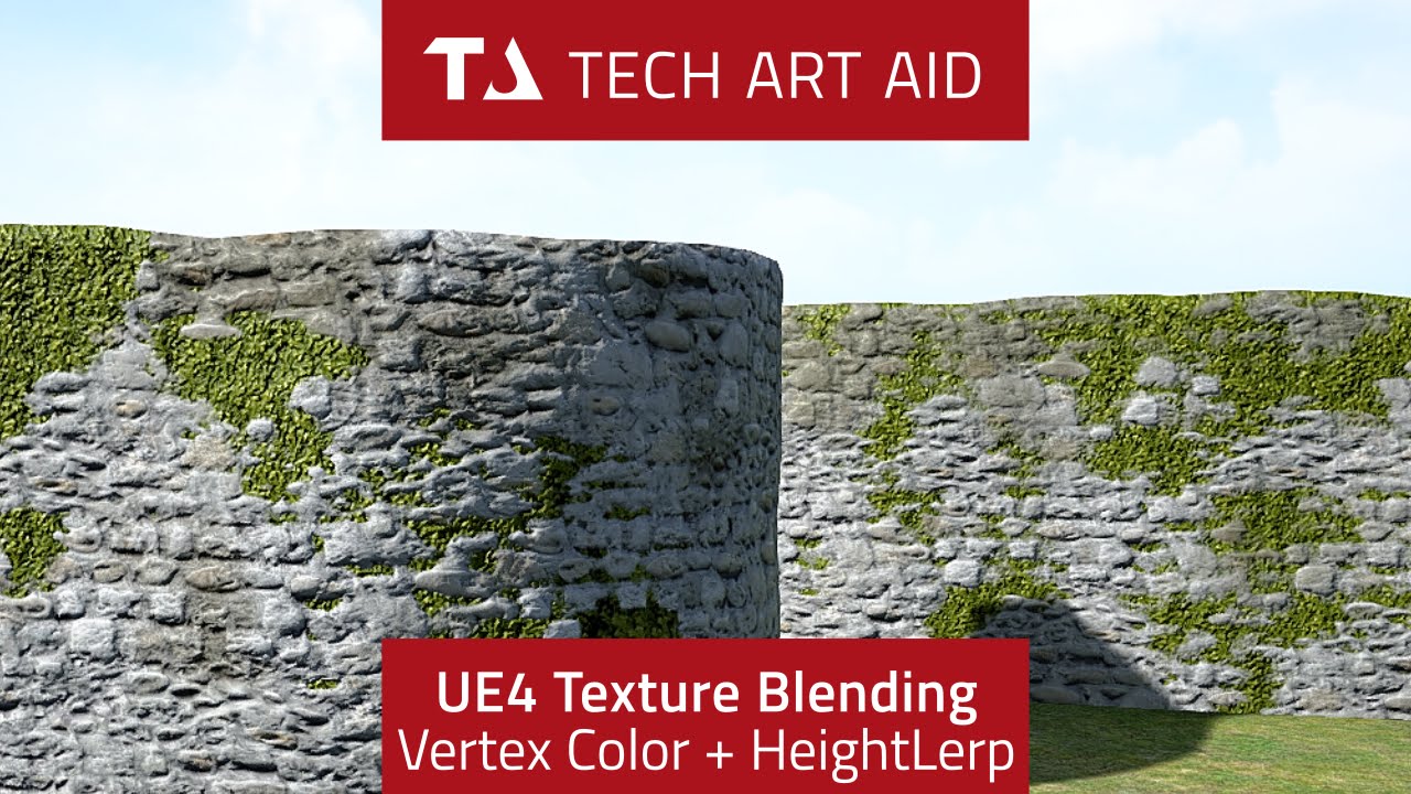
The vertex paint was also mentioned in GAMA3005, since I created materials for the modular assets. To prevent the repetitiveness of the textures, I use vertex paint to add some further details and get the worn out walls, floor and ceiling. I have used these three tutorials above and master materials to create my own 3 blend vertex paint and a height lerp. The height lerp will be useful for the wooden floor and dirt, I want to make the dirt sink into the gaps between the planks. This makes it look a lot more natural.
I have been experimenting with the vertex paint before, so I knew about the basics. Other than that, I haven't looked into the graph editor until now. This is because I wanted to include some custom changes, the three tutorials have got some useful tools I want to put into one master material such as height lerp, parameters and connecting the material attributes. I used the Tech Art Aid (left) tutorial as my main master material, this included 3 blends and heightlerp. The two other tutorials had the parameters and material attributes I wanted to add to the main master material. Since I have used Substance Designer, master materials and material instances I found it easy to understand the nodes and connect them.
How is it used?
Besides preventing the plaster and wood floor looking repetitive, I used this method since it's used in the game industry for the same reason. Vertex paint is normally done inside the game engine by using the RGB channels. Each channel has its own material, by using the nodes in the material editor it allows me to add further options. As an example a parameter for the blend, I can adjust the value depending on how much I want materials to blend with each other, giving a softer or sharper blend. Besides that, it's a much faster method to do things inside the engine such as vertex paint. It's useful on modular assets since it contains tileable textures, it's a way better option than texturing a wall one by one in Substance Painter.
The vertex paint and height blend master material I have created can also be used as a material instance which can be re-used on multiple assets. It is a very efficient and quick method. I could also use the same master material for my future projects, meaning I won't have to create a new master material from scratch.


With heightlerp and without the height lerp gives a large difference, the left one is what I used for a while. But the dirt looks like it's being laid on top of the floor in an unnatural way. Looking how dirt would behave on wooden floor was something I had to look into as well, therefore implementing height lerp was a better option. It uses a height map, the black will sink into the deeper areas and white is clear. There it also a third blend vertex colour but it isn't very obvious due to the dark wood. Although, the third blend is more useful on the walls to add mold and dirt. I am more pleased with this outcome, I have been struggling to sort out the vertex paint, I did use the Tech Art Aid before but stopped because I liked the parameters the master material (right) had.
After some adjustments and putting the tools together, I now have all those in one master material. I'm also starting to feel how my knowledge is starting to improve, with some practice in some other software's and areas it's easier to understand now. I have also found different ways to organise inside the graph editors to make it easier for me to understand and follow. I played around with the dirt saturation, as I implemented this into the master material as well. It will make it a lot easier for me to work with, as I don't have to edit the material in Substance Designer or Photoshop.


Before - Vertex Paint - Simple master material
• No height lerp
• 2 blends - Clean plaster and damaged plaster
• Looks too flat

After - Vertex paint and height blend
• Added heightlerp and managed to break the attributes to use the parameters for individual textures
• 3 blends - Clean Plaster, Damage Plaster and vertex color dark green
• Blend contrast and height invert, creates nicer pattern when painting


For the decals, I set up a simple decal master material to test out the graffiti wall. It is a much faster way to work and get away with details, it also adds storytelling to the scene which is an important part for this scene or any games. I have been looking into the floors, walls etc in Call of Duty Black Ops as example when I have been plating. There are a lot of blood spatter and bullet holes decals on the modular assets. This adds a bit of storytelling but can also help to prevent and receptiveness like vertex paint.


Normal Edge Decals - Experiment and issue
I refined my normal edge decals since I did a quick experiment in my pre-production stage. I also had issues where black lines would appear due to the alphas not being masked out properly.
Normal Edge Decals - Solved
The way I tackled the issue was to bevel the edges for the high poly to give a cleaner bake, this would help when I edit the normal map in Photoshop later. It flattens the empty spaces between the sculpted areas which prevents me from removing those manually.
This time, I was more precise masking the normal, I used a soft brush to mask the shape and eventually use a hard brush to refine and get the smaller details.
The results came out a lot better and I find the normal edge decals very handy as I don't have to sculpt any unique details on the assets.


I'm adding a few more spider webs for my scene as I want different shapes around the corners, connecting spider webs going from one to another as example. I downloaded the free spider webs from Chris and Flippednormals. I just used the first alpha from Chris and added a few more spider webs from FlippedNormals in Photoshop. This saves me more space and more efficient to work with. The process was to use a plane on maya, uv before applying texture and then apply the texture. From there I use multi-cut to add edges and cut faces. It is a really simple process as it works the same way with foliage or hair cards as example, this also keeps a low poly.
I had to use a different spider web master material in Unreal engine since the transparency didn't work very well for this texture. I found this material on Twitter by some other artist, ideally I also had the plan to use a color for the base color giving me a stronger color in the scene. The opacity is the alpha, the parameter, power, vertex color and multiply is to increase the opacity for the spider web. This material worked really great which showed all the details. The spiderwebs should give an idea that those areas have been untouched and is abandoned.
Chris - Spider webs: Link
Master Material for Spider web: Link


Feedback - Composition/narrative
Perhaps have one machine that has fallen down, to show some storytelling.
Right side is currently a bit empty, add some gasmasks on the right side to show off the narrative, also make it point towards the door to create some leading lines.
Experiment with the focal length camera, this might give a better composition. Move the camera up or to right side to make the middle section more visible.
The dance machine is currently covering the middle of the scene, makes it difficult to read the stool.
I have been receiving some great feedback from Ryan Manning's Discord server, people from the course and I have spoken to a friend of mine on Discord to give me some advice and feedback. When I posted this photo, the lighting was pretty much untouched with some small tweaks. To summarise the feedback:

Feedback - Assets
Make the assets on the right side less vibrant, the color is currently too strong.
Difficult to read the stool, the dance machine covering the stool which makes it difficult to read the asset and color looks a bit flat.
Feedback - Lighting
The lighting has quite a lot of work that needs to be improved, mainly the lighting isn't helping with the storytelling.
Not using enough direct/indirect lighting to show details and shadows. Using indirect lighting will make the lighting bounce which will fill up the space.
The directional light should have intensity around 3.14 as it's more realistic and using temperature usually gives a bit more realism.
Make the scene darker, use point lights to fill up dark areas.
Perhaps include some flickering light for the string light on the right side.
Whilst adjusting the lighting with the feedback I have received, I looked into 80lvl articles, videos, conferences and artstation to get a better idea of lighting. There were a couple of things on the feedback I was unsure about, such as how to use the direct and indirect lighting to draw attention to details. Besides that, I had to look into dynamic and baked lighting, and when do I use moveable, static and stationary lighting?
The videos and articles are used to help my lighting settings and improve the quality.
Volumetric fog
Directional Light
Light Shaft
Fill in dark areas using point light and reflection capture
Lighting information
Purpose
Settings
Dynamic and baked lighting
Settings for bake and help with modular asset light issues
I folloed this exponential Height Fog Settings
Is my scene static or dynamic? [28]
Considering my scene is to showcase my work, I can go with static lighting. My scene isn't playable and won't require any movement by the character as example. I explain it a bit more below.
Baked lighting vs Dynamic lighting? [28]
Baked Lighting is a cheaper option since it requires rebake each time changes are made. Baked lighting require static or stationary lighting, static lighting is lights that never change whilst stationary lighting has an animation with it such as intensity. Stationary and static can't be moved. Considering I 6 point lights for the string lights, I can't set them as stationary since maximum 4 stationary light can overlap.
Baked Lighting This is more demanding in memory but gives much better results. Baking also needs lightmaps, it is basically stored for the lighting level. The UVs cant be overlapped and must be unique, if the UVs overlap the stored shadows and light might be incorrect. The light map resolution can be adjusted, a higher light map resolution is slower to generate but gives better shadows.
Dynamic Lighting is real time, meaning it updates whenever any changes are being made. Dynamic lighting updates all the time which needs to be set as movable. In this case, I have flickering light in my scene which is dynamic lighting. In games, if it's an open world it's most likely the game will be dynamic since the player is constantly moving and might require building stuff such as Fortnite.
What is the difference between direct and indirect lighting?
Direct lighting comes from specific object or to focus on any specific areas, such as a screen. Spotlights, point lights and directional lights are a few examples that are used in my scene.
Indirect lighting focuses on larger areas giving an even smooth light. The indirect light tends to bounce on walls which gives and even smooth lighting and shadow.
How can I improve my lighting quality? [28]
I am aware of the Lighting Build Qualities as it has different options such as preview and production. Production will be my final bake as that's the best lighting I will get.
Besides that, the World Settings has a Lightmass Settings which got a couple of options to improve the lighting quality.
Static Lighting Level Scale - Reducing the value gives higher value but increase noise, it bakes a smaller portion of the world.
Num Indirect Lighting Bounces - How many times the light is going to bounce around, normally 3-5 is a good number. Going too high can get too expensive.
Indirect Lighting Smoothness - Smooths out the shadow, too high value can cause bleeding and incorrect shadow. 0.7 and 1 is great value.
Indirect Lighting Quality - Building time, by selecting preview or production the building time can be longer.
To prevent noise appearing, the Static Lighting Level Scale x Indirect Lighting Quality = 1.0. By multiplying those two and get the 1.0 results, it will reduce the noises.
Volume Light Samples - Small spheres placed in the world and calculates the indirect lighting during the lighting build. If it's dynamic lighting, the Volumetric Light samples uses a interpolated/insert (mathematic term) the each pixel being shaded, this gives a pre-calculated indirect lighting.
What is a Light Portal? [28]
What the Light Portal does is that it makes the Lightmass come with more light rays around the area giving better light and shadows. I added a light portal for the broken ceiling since it is an open area, it is also good to use with a skylight which I have in my scene.
Explaining how I used my research to set up my lighting
The slide explains how I achieved my final lighting, this took me around 6 days to adjust the lighting and redo it 2 times. It was challenging as I have never worked with dark environments before. Although, I have been able to improve my lighting and achieve realistic results by following references, a lot of research and follow my benchmarks.
Light shaft, volumetric fog and understanding light settings
I followed Victory3D to set up my light shafts and to fill in the darker areas I had, using both point light and rect light. Whilst I was working on that, I was researching lighting at the same time, I looked into Lighting with Unreal engine Masterclass to understand the world settings and the light options, such as light bounces, smoothness as I mentioned above. By knowing the settings, I was able to get a more efficient workflow as I knew the purposes of the light settings.
I wasn’t completely satisfied with the light shaft yet, however I found something very useful about directional light, giving it an intensity of 3.14 lux makes it a lot more realistic, it might not be as strong with the volumetric fog. But this is how realism works, overexaggerating the light shaft with the volumetric fog looks cool but doesn’t give make it look realistic.
Reflection captures and realistic lighting temperature
When I had my direct and indirect lighting set up, I followed the lighting artist Brian Leleux post process settings to get a more natural lighting and better shadows. Using reflection such as box and sphere, it will give accurate reflections, for the arcade machines as example since those contains metal. I never knew the purpose of the reflection capture until now and it makes a huge difference and makes the reflection precise. Brian Leleux also had some great advice for lighting temperature, this would be for my string lights. And normally the temperature is around 2000-4000, this is more accurate to realism. It adds warmer tone but is accurate with most household bulbs. Lastly, I used the similar settings for the post process to achieve better shadows and lighting.
Production bake
Since I'm using baked lighting, I followed Polygon Academy's and Lighting with Unreal engine Masterclass tutorial to improve my final production bake, I changed the shadow for direct and indirect light and increased the values in the world setting. This was in fact the reason why my production bake took 10 minutes before, it was also because I worked with dynamic lighting, didn’t have my light set to static and didn’t have my world settings changed.
How do I get better resolution screenshots?
My renders are in 4K, I will be posting them on Artstation but is appearing quite blurry. Ryan Manning posted a tutorial whilst I was doing my renders to get better high-resolution screenshots. The method was very simple, by changing the screen percentage by the arrow on the top left window. This gives much sharper quality and shows the details. I wasn't pleased with the screen percentage at 100 as it looked too blurry and cuts off the details. By setting the screen percentage to 200, the roughness and height details were very clear. And I think this is very important to showcase for my portfolio as I want to show that I have paid attention to details, especially the dance machine.
To briefly summarise this project, I really feel it has been a success as I have been able to achieve my goals through research, feedback, experimenting and learning lots of new stuff. I did have my weaknesses but managed to work on them during this journey. There is still a lot to improve on such as lighting, composition, materials and more. However, I can definitely say that I can take everything I have learnt from this module into my next project.