Embedded Files

R2% of the variability in the y-values can be explained by a linear relationship with the x-values.
R2% of the variability in the y-values can be explained by a linear relationship with the x-values.
Interpreting Slope and y-Intercept on Scatterplots
Interpreting Slope and y-Intercept on Scatterplots
The slope of a linear association plays the same role as the slope of a line in algebra. Slope is the amount of change we expect in the dependent variable (Δy) when we change the independent variable (Δx) by one unit. When describing the slope of a line of best fit, always acknowledge that you are making a prediction, as opposed to knowing the truth, by using words like “predict,” “expect,” or “estimate.”
The y-intercept of an association is the same as in algebra. It is the predicted value of the dependent variable when the independent variable is zero. Be careful. In statistical scatterplots, the vertical axis is often not drawn at the origin, so the y-intercept can be someplace other than where the line of best fit crosses the vertical axis in a scatterplot.
Also be careful about extrapolating the data too far—making predictions that are far to the right or left of the data. The models we create can be valid within the range of the data, but the farther you go outside this range, the less reliable the predictions become.
When describing a linear association, you can use the slope, whether it is positive or negative, and its interpretation in context, to describe the direction of the association.
Least Squares Regression Line
Least Squares Regression Line
There are two reasons for modeling scattered data with a best-fit line. One is so that the trend in the data can easily be described to others without giving them a list of all the data points. The other is so that predictions can be made about points for which we do not have actual data.
A unique best-fit line for data can be found by determining the line that makes the residuals, and hence the square of the residuals, as small as possible. We call this line the least squares regression line and abbreviate it LSRL. A calculator can find the LSRL quickly. Statisticians prefer the LSRL to some other best-fit lines because there is one unique LSRL for any set of data. All statisticians, therefore, come up with exactly the same best-fit line and can use it to make similar descriptions of, and predictions from, the scattered data.
Residuals
Residuals
We measure how far a prediction made by our model is from the actual observed value with a residual:
residual = actual – predicted
A residual has the same units as the y-axis. A residual can be graphed with a vertical segment that extends from the point to the line or curve made by the best-fit model. The length of this segment (in the units of the y-axis) is the residual. A positive residual means that the actual value is greater than the predicted value; a negative residual means that the actual value is less than the predicted value.
Residual Plots
Residual Plots
A residual plot is created in order to analyze the appropriateness of a best-fit model. A residual plot has an x‑axis that is the same as the independent variable for the data. The y-axis of a residual plot is the residual for each point. Recall that residuals have the same units as the dependent variable of the data.
If a linear model fits the data well, no interesting pattern will be made by the residuals. That is because a line that fits the data well just goes through the “middle” of all the data.
A residual plot can be used as evidence that the description of the form of a linear association has been made appropriately.
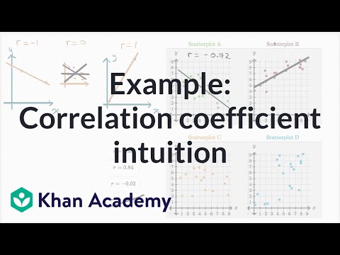
Correlation Coefficient
Correlation Coefficient
The correlation coefficient, r, is a measure of how much or how little data is scattered around the LSRL; it is a measure of the strength of a linear association. The correlation coefficient can take on values between −1 and 1. If r = 1 or r = −1 the association is perfectly linear. There is no scatter about the LSRL at all. A positive correlation coefficient means the trend is increasing (slope is positive), while a negative correlation means the opposite. A correlation coefficient of zero means the slope of the LSRL is horizontal and there is no linear association whatsoever between the variables.
The correlation coefficient does not have units, so it is a useful way to compare scatter from situation to situation no matter what the units of the variables are. The correlation coefficient does not have a real-world meaning other than as an arbitrary measure of strength.
The value of the correlation coefficient squared, however, does have a real-world meaning. R-squared, the correlation coefficient squared, is written as R2 and expressed as a percent. Its meaning is that R2% of the variability in the dependent variable can be explained by a linear relationship with the independent variable.
For example, if the association between the amount of fertilizer and plant height has correlation coefficient r = 0.60, then r2 (or R2) = 0.36 and we can say that 36% of the variability in plant height can be explained by a linear relationship with the amount of fertilizer used. The rest of the variation in plant height is explained by other variables: amount of water, amount of sunlight, soil type, and so forth.
The correlation coefficient, along with the interpretation of R2, is used to describe the strength of a linear association.


Page updated
Report abuse